PROJECT LINKS
Introduction
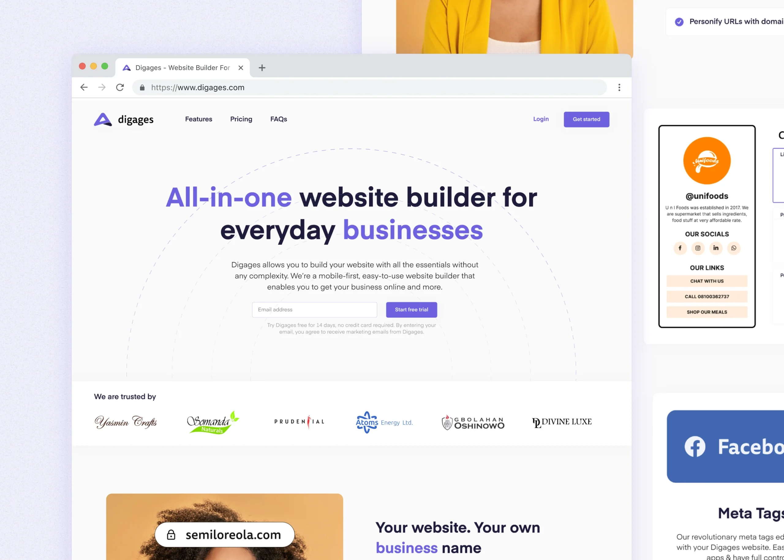
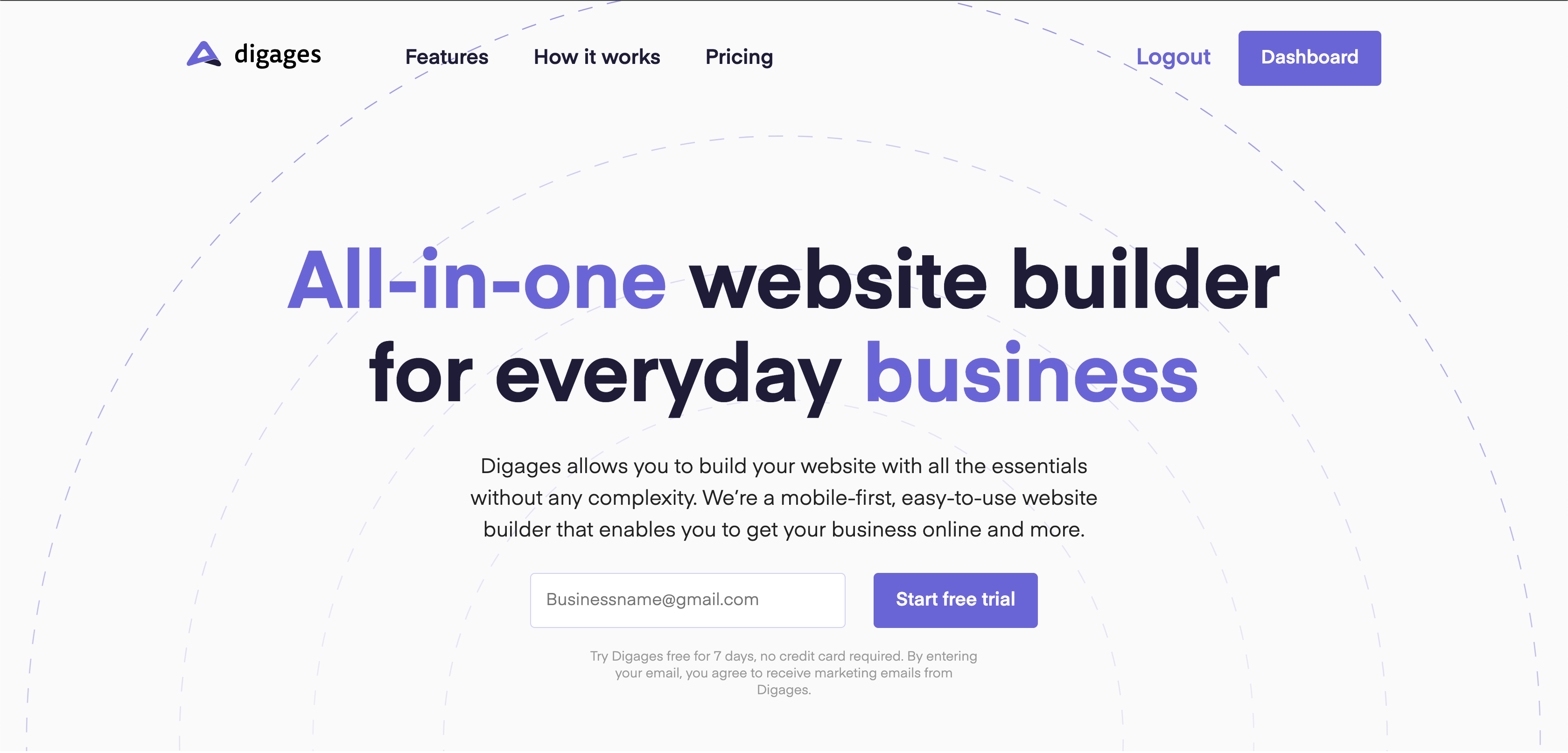
Digages is a SaaS website builder. It’s a mobile-first, easy-to-use website builder that enables you to get your business online.
I led the design and marketing of the product, and I collaborated with the engineering team to build the first version of Digages.
What set Digages apart from my previous projects was the unique challenge it presented – at its very inception, we had paying customers waiting for it, with the vision of replacing the existing CMS used for their one-page websites.
Designing Digages
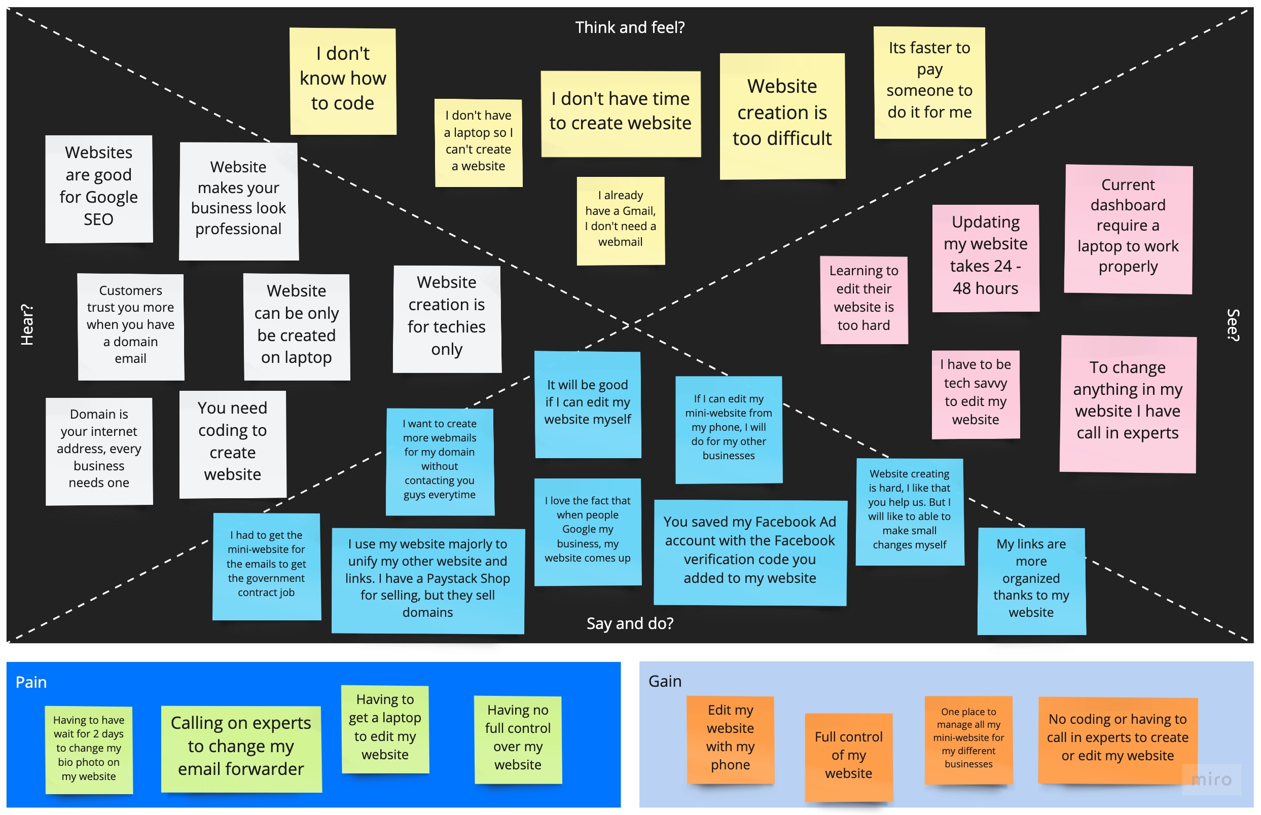
To kick things off, I reviewed existing clients’ website usage to gain a general understanding of the kind of users we were designing for. After this, I moved on to interview some of them to better understand their different levels of tech aptitude. This was imperative to create user personas and empathy maps that would serve as the bedrock for our design decisions.
With these insights in hand, we documented every piece of information, which allowed us to pinpoint the critical stages in the website-building process. These stages included crucial decisions such as selecting color schemes and adding content, which we recognized as pivotal to the user experience.
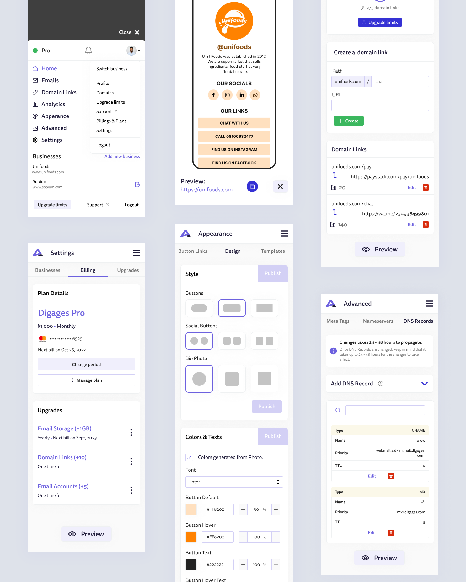
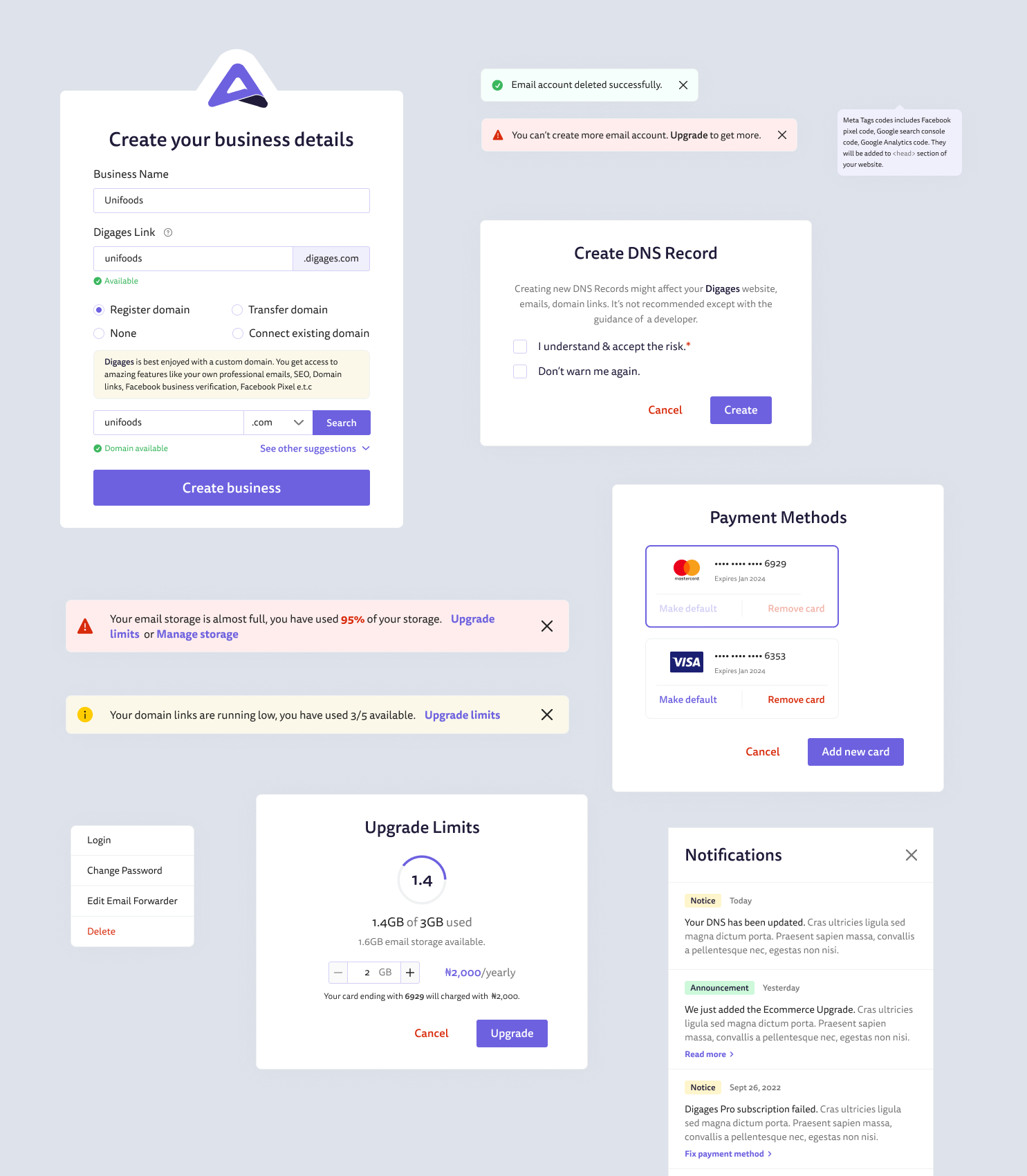
Moving on, Digages designs was made using Figma. A design system was created to keep things consistent. After exploring multitude of different flows and styles, the designs of the products were ready for testing.
PS: For some critical stages, we created two versions of the design subject to A/B testing
Usability tests & Re-iterating
Due to the peculiarity of the product, being easy-to-use was paramount to the stakeholders. So after major designs were completed, we recruited some of Digages clients with different level of tech appitude to test out somee features in the web app.
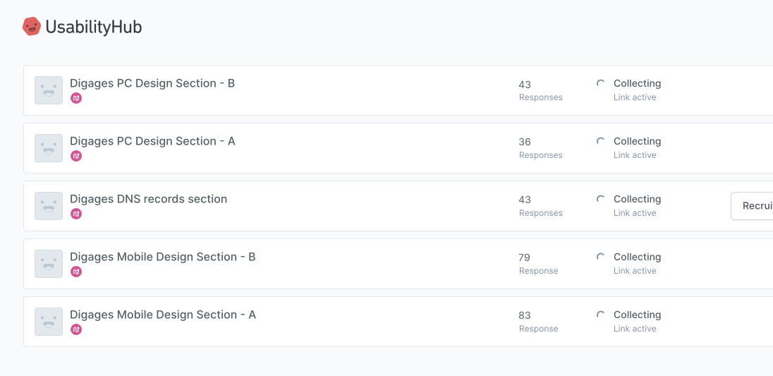
Testing yielded majorly positive results, and in some cases we redesigned some screens to better cater to our users need.
Interactive Prototypes & Videos
I created some interactive prototypes and motion graphics. These prototypes served as powerful tools for demonstrating our design concepts to stakeholders and engineers, ensuring a shared vision for the product’s evolution.
Prototype of Digages hero section
Video used on landing page domain section
Video used on landing page editor section
Handoffs at different stages
Given the technical complexity of the project, maintaining a seamless alignment between design and engineering was crucial to ensure practicality and feasibility within the established timelines and deliverables. To achieve this, we executed handoffs at various key junctures during the project’s development. These included significant milestones such as the design system, landing pages, authentication and login flows, among others.
Closing thoughts
My journey with Digages was an exciting and multifaceted experience. As a Product Design Lead, I had the privilege of leading a talented team of five individuals, each contributing their unique skills to our shared vision. Check https://digages.com/
