Overview.
MyTreatlist allows you to receive better gifts. With MyTreatlist, you can easily create a list of “treats” you want – and instantly share with your friends and families.
Problem statement.
The most important part of MyTreatlist is the list creating section of the web app.
After the launch of MyTreatlist, while analyzing the web app usage via MySQL. The engineering team noticed lot of abandoned lists and relatively long time spent creating lists.
I was brought in to work with the design team to discover and proffer design solutions that will solve the problem.
User interviews & Research.
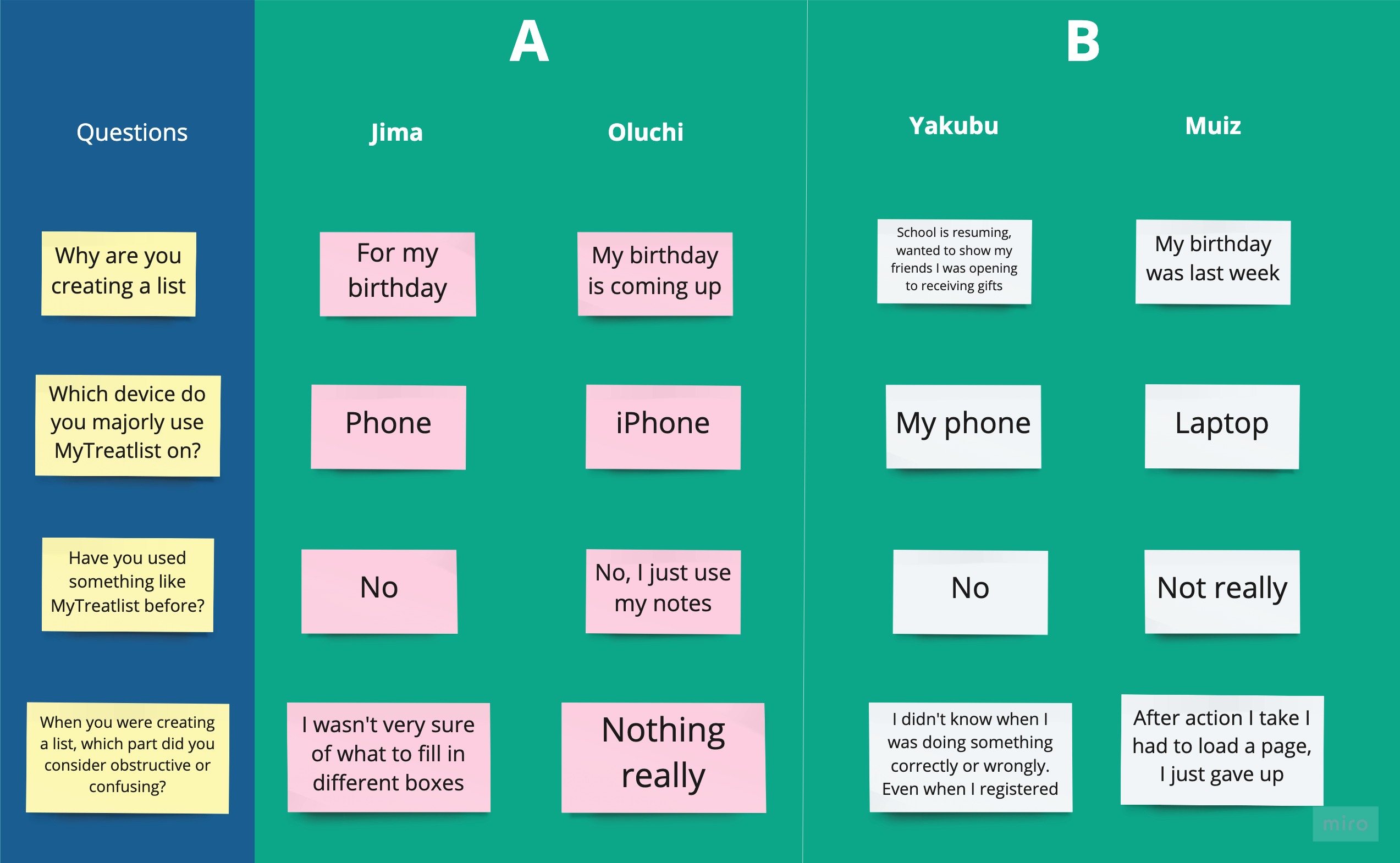
On approaching the problem, it was crucial to get an in-depth understanding of the users. The first thing I did was divided the users into two focus groups. The Ones that they were successful with creating lists and those that weren’t. I prepared questions to probe into these users’ tech backgrounds, motivation for using MyTreatlist, devices e.t.c.
Participants were recruited over emails & Social media as we already had their details when registering.

Group A were the successful ones, Group B were unsuccessful
Note: Normally, I will have suggested Hotjar to check website usage. But the engineering team already had a custom-developed solution, which was even better. As it gave us access to check individual user usage, time spent, pages they navigated and tons of filter options.
Screenshots of the website usage have been intentionally omitted due to legal constraints.
Solution.
