Silktag

Designed and developed the official eCommerce website for a bespoke fashion brand – Silktag.

Role

UI/UX designer, Web developer

Tools

Figma, Canva, WordPress + Woocommerce, Google Drive, Google Meet

Industry

eCommerce website, Fashion Brand

In this page

  • Overview
  • Problem statement
  • Preliminary work
  • Design process
  • Development
  • Outcome: Solution & Metrics

Overview.

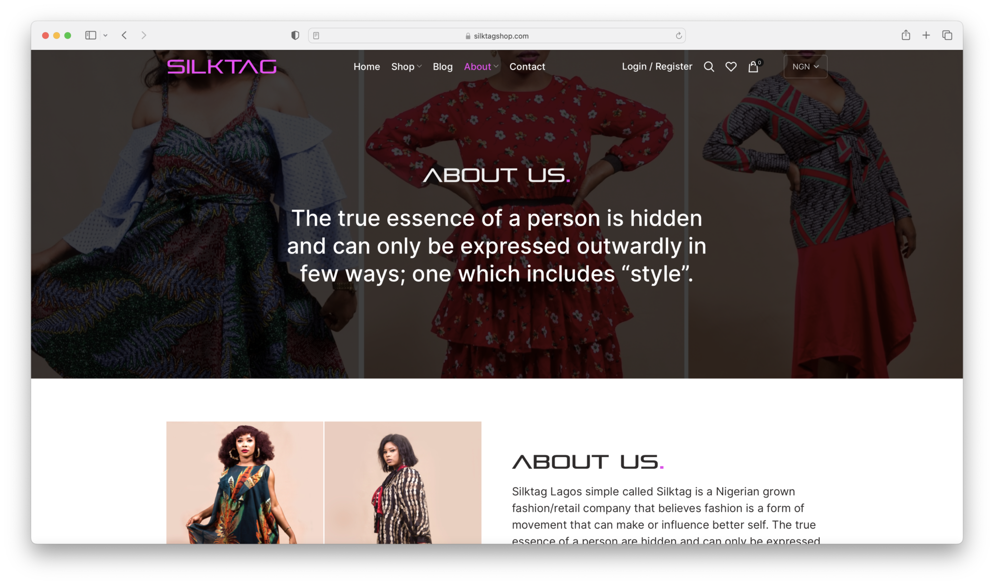
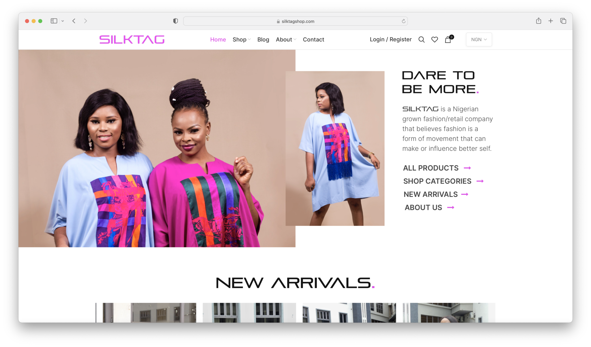
Silktag is a Nigerian grown fashion & retail company that believes fashion is a form of movement that can make and influence better self.

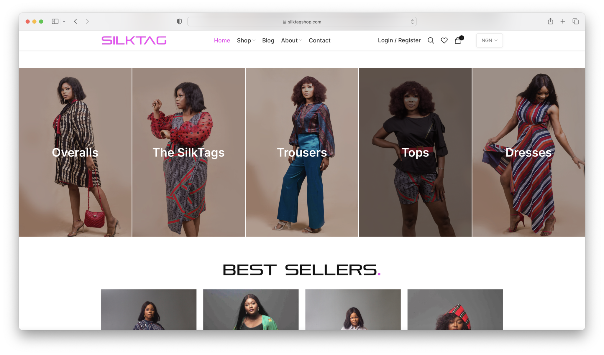
The goal of the project was to design an ecommerce website that aligns with Silktag values. I was tasked with designing as well as developing the website.
Problem statement.

This wasn’t the first attempt at a website by my client. The previous website she developed was majorly plagued by long load times, complicated checkout flow and poor navigation (paraphrased).

Preliminary work.

Competitive analysis

The client sent examples of websites that she loved for their UX, design and flow. I moved to doing a competitive analysis of these website in the context of e-commerce features I will adding to her website.

User flow

The next step was to create the user flow, which defined the major routes in the user journey through the e-commerce website.

Design process.

Requirement Gathering

Silktag business writeups and images were shared over emails & Google Drive respectively. Designs were tuned to fit the writeups & available pictures

Note: I worked directly with the Founder & CEO, which made the information-gathering process very swift.

Style Guide

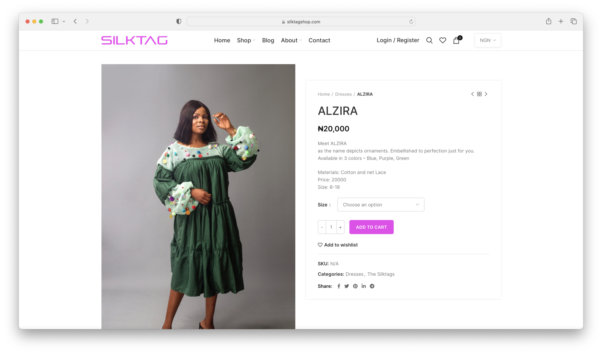
I made use of the font used in the Logo for headings – “Pirulen” & chose  “Inter” as the body & paragraph font because of its timeless look.

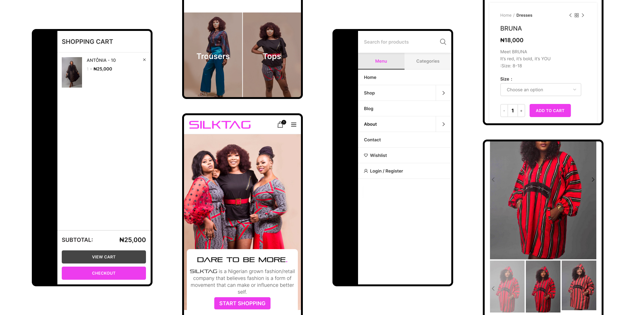
High-fidelity Designs

Note: One of the advantages of being in charge of the design & development was the smooth handoff.

Development.

Choosing Stack/CMS

I decided to go with WordPress + Woocommerce, as it is the most budget-conscious option available, and my client already understands the layout of WordPress.

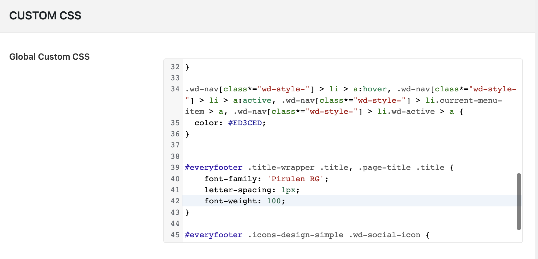
I made use of WP Page Bakery as the website builder, as it allowed for more customization with CSS, to get the look I was aiming for.

Note: I’ve worked with WordPress numerous times, so this was a preffered stack for me too.

Outcome

The client really loved the website and her customers as well. It solved major issues her former website had. Link: https://silktagshop.com/

Solution & Metrics

Decreased Load times: I used Hostinger Cloud Hosting, and made use of Litespeed Cache for superior performance.

During development, I minified the custom CSS, and use Lazyload for images to ensure fast load for pages.

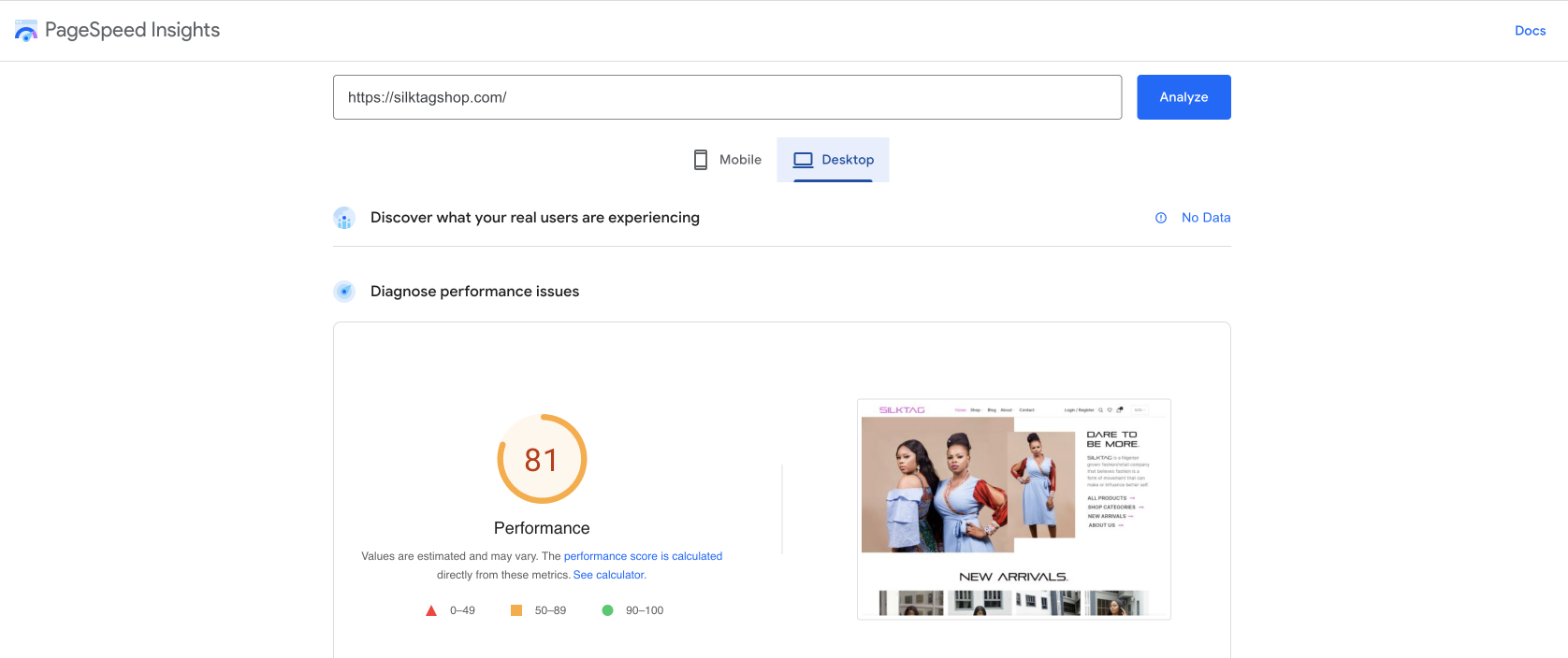
It paid off, as we got a performance score of 81 on Google Pagespeed Insights.

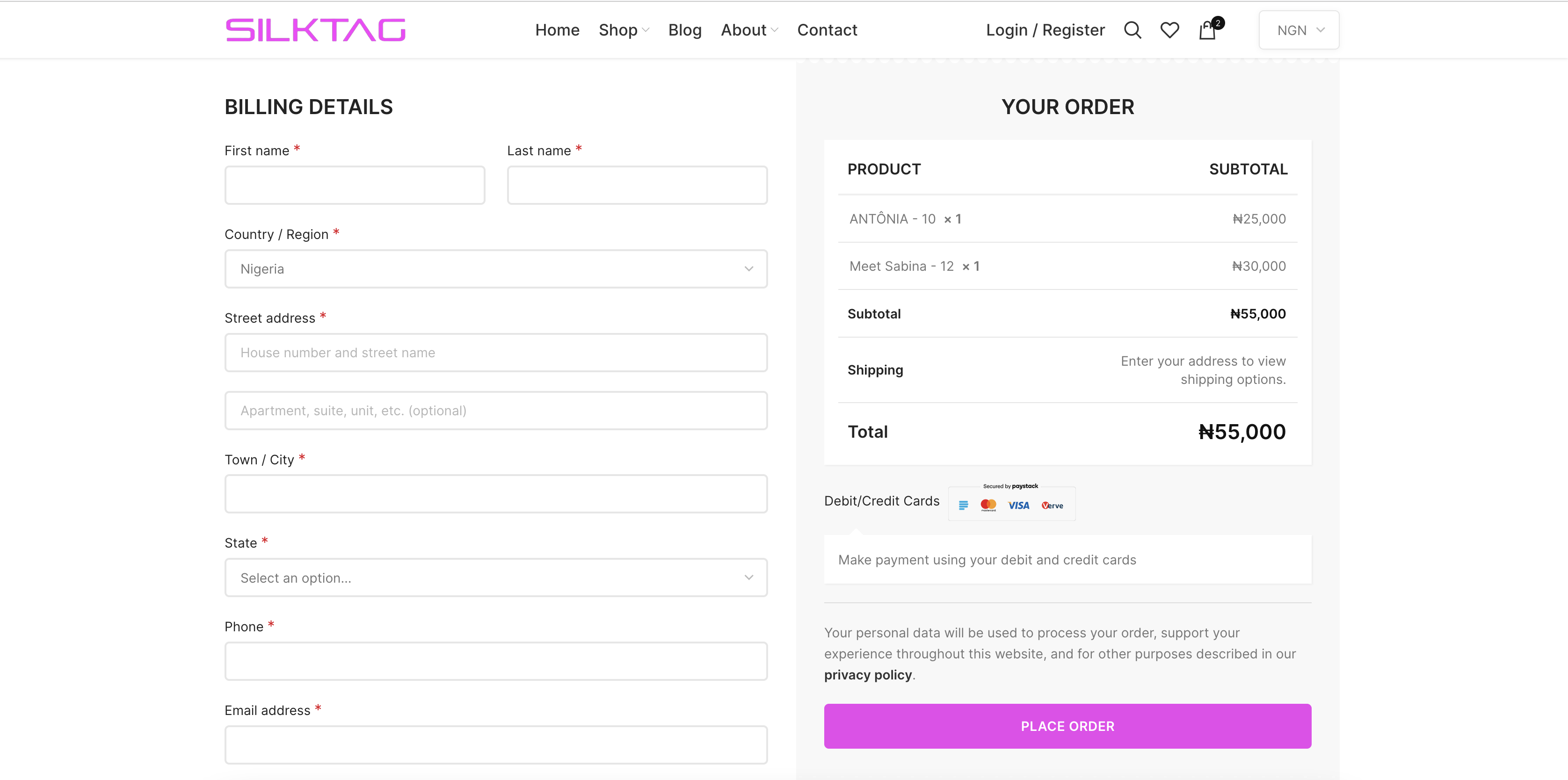
Improved Checkout Flow: In the first iteration, we noticed abandoned checkout majorly due to forcing registration, (I tracked using the “User Activity Tracking and Log” WP plugin). After different iterations and testing, we automated the registration process and made it optional. This improved the checkout flow by 35%